 |
| Conan O'Brien's new show, "Conan" |
I've been reading/looking through the
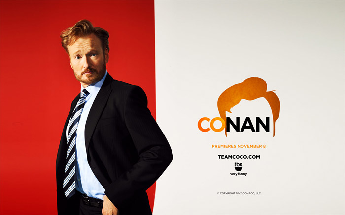
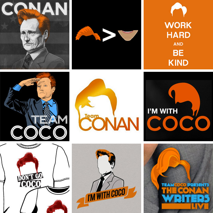
idsgn blog recently, and came upon a entry upon the new logo designs for Conan O'Brien's new show on TBS called, "Conan." I noticed how they used salient characteristics of Conan O'Brien (his trademark red coif-like hair) to create a unique and easily memorable icon and designs. With that, the color scheme always utilizes orange because even the color has become a trademark. What initially may have seemed to be a joke has manifested into a big campaign by fans celebrating his iconic red hair:
What incited this campaign was the rivalry between Jay Leno and Conan Obrien after Leno had taken over The Tonight Show. It's interesting to see the simplicity and the creativity of the designs that convey an effective message about their support for "Coco."
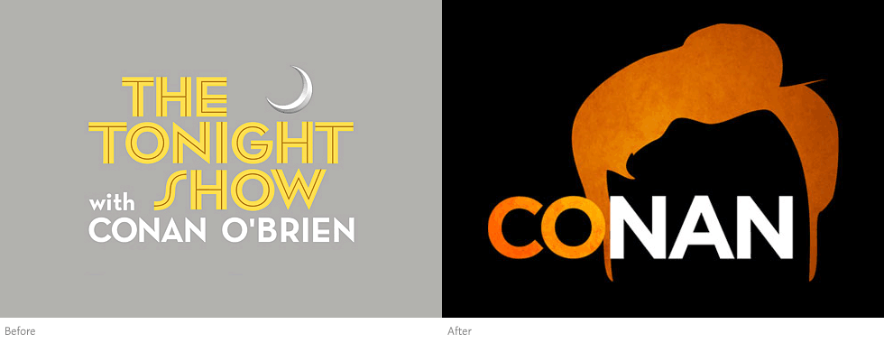 |
| The old and new design for his show. |
The new design of the logo is a great difference from the first logo. It is more ambiguous with the use of just one word "Conan" and one big image of Conan's iconic hair. I guess the objective of the new design was to be more direct and "in your face." The simple black background alludes to the "tonight" show. The use of a small gradient makes the design more aesthetically pleasing and dynamic compared to the first logo, which is necessary because of the simplicity. It gives a different, more flashy mood. The first logo is more professional and aesthetically pleasing in terms of typography with the use of three different fonts. It emphasizes "The Tonight Show" more than the [former] host "Conan O'Brien," unlike the new logo that makes "Conan" the main focus.
Credits/Links:
[Coco's new 'do @idsgn.org]
http://idsgn.org/posts/cocos-new-do/
No comments:
Post a Comment