Monday, November 29, 2010

Design in Society: Simple hooded lighting fixtures

          In design, there is a lot of focus on innovation and improving society. They are major objectives of designers, and the simple design of hooded lighting fixtures are an example of utopian design as it tries to improve society economically, environmentally, and health-wise (of individuals and animals alike) by reducing light pollution. Hooded light fixtures and the components that make up its design, such as the type of light bulb used, all contribute to the enhancement of society.
"GlareBuster GB-2000", the original dark sky friendly light
        The "GlareBuster GB-2000" is a outdoor lighting fixture I come upon while I was checking out the Starry Night Lights website which is an online store specializing in lighting fixtures that help reduce and reverse light pollution and promote dark starry night skies.The "forward-throw cut-off" form and shape of GB-2000 is specifically designed so that light is directed to the ground efficiently, which reduces glare and prevents light from escaping into the atmosphere.

          Aesthetically the GB-2000 is not much of a visually pleasing design because it is plain, boxy, and only comes in generic white and bronze color, but being one of the first of its kind, it does the tasks that it is intended to. This is where innovation comes in, and designs with the same objectives are created that meet standards that prevent light pollution that were derived from the GB-2000 and the personal styles of individuals as well. There is a freedom in the many different kind of lighting fixtures with hooded design so it is easy for designers to produce varying styles of lighting fixtures like wall laterns, sconces, shades, etc.

Outdoor Wall Lamp

Wall Sconce

Aluminum Bollard Pathway Light
Lamp shade with Compact Fluorescent light bulb
          As I've mentioned earlier, the use of these dark-sky friendly light fixtures improve society economically, environmentally, and health-wise in humans and in animals. It improves society economically because most of these fixtures use energy efficient compact fluorescent bulbs, like the GB-2000, which uses less energy and they have a photocell that makes sure that it only operates at night, so you save money on energy bills. The environmental improvement is something I've already covered, as it reverses light pollution. And lastly, it improves the health of humans and animals. Light pollution affects the natural circadian rhythm of humans and animals in which there is evidence that strongly suggest that there is "an etiology of suppressed melatonin production, depressed immune systems, and increase in cancer rates such as breast cancers," (American Medical Association) due to light pollution.
           The simple hooded lighting fixture does a lot to try to improve society, making it such a utopian design.

Credit/Links:
[All images and products] http://store.starrynightlights.com/
[IDA - International Dark-Sky Association] www.darksky.org
[PDF - American Medical Association - Resolution 501, page 52] http://www.ama-assn.org/ama1/pub/upload/mm/475/refcome.pdf

Color Transforms: Pointillism and Paul Signac

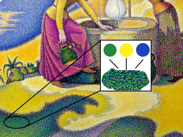
"Women at the Well" by Paul Signac
 (1863-1935)

          The painting pictured to the left is by a French neo-impressionist painter named Paul Signac, who helped develop the technique of pointillism. Pointillism uses dots of pure colors juxtaposed together to create an effect of creating an illusion of a mixed color, for example, if you painted a bunch of blue and yellow dots in one area you may create the illusion of green. Signac is a master of this technique and in this way, you can see how color transforms the design of a painting.
          In Josef Albers' Interaction of Color, Albers covered a lot of concepts on color theory that I could barely comprehend as it changed my perspective on how we view colors as he explained them so frankly in my brief skim through the chapters. There were chapters on optical illusions, and chapter XIII on The Bezold Effect (page 33) briefly covered optical mixtures, which is exactly what pointillism is about. The combinations of the colors colors green, yellow, blue, and magenta are prominently used in "Women at the Well" to create hues and shades that provide contrast and make the subjects and background realistic and 3-dimensional.The limited color palette make it a challenge and forces the painter to create optical illusions of color.
          Yellow and white are the main colors that provide light in the image. The cool blue creates a stark contrast to the yellow because they are complementary colors, so their synthesis in the painting make it more vibrant and bright. Their juxtaposition in the painting creates a balance of yin and yang; if you look closely on bottom of the lower half of the painting, the shape of what seems to be a shadow exhibit a kind of balance and so does the top half where the two colors are separated diagonally by the shape of the hill.
          Color transforms everything in the visual world. Albers mentions in his book that the visual perception of color is subjective because it is "almost never seen as it really is," and there are innumerable meanings and perceptions of every single color. "Women at the Well" displays this idea effectively because the hues and shades in the painting are achieved through the brain's perception of the color combinations, whether they subtract or add intensity, and it harmonizes them in allows the viewer visualize the whole painting and its hues and shades instead of each the actual individual colors.


Credit / Links:
[Close up, detail of "Women at the Well"] http://en.wikipedia.org/wiki/Pointillism
[Paul Signac bio] http://www.paul-signac.com/
[Josef Albers' Interaction of Colorhttp://www.amazon.com/Interaction-Color-Revised-Josef-Albers/dp/0300018460

Saturday, November 27, 2010

Dangerous Design: Four Loko

'Four Loko' Alcoholic Energy Drinks
        'Four Loko' and the fight to ban it from politicians and the government has been a popular topic in college news the past two months. The design of the Four drinks is dangerous to society because it looks like any other energy drink; the colorful and flamboyant design make it visually appealing and attractive. The can form of the 'Four Loko' drink, and the design on it make it look more playful and targeted to a younger age group (college students), compared to other alcoholic beverages which are usually in either in bottles or cans and have more sophisticated designs. The Four Loko drinks are a dangerously potent mix of caffeine and alcohol, as well as taurine and guarana to make up the four main ingredients. The size of the Four Loko can manipulate the drinker into drinking a lot more than the ideal serving size, and thus making the person drunker and affecting their health more negatively. It contains 12% alcohol in one 23.5oz can, which is equivalent to 5-6 cans of beer. In addition to that, since the caffeine reduces the feeling of "being inebriated," more people can unknowingly drink themselves to the point that they black out or pass out. There are instances that have shown seriously adverse side affects from drinking Four Loko drinks that has deemed Four Loko to the a concern to public health, which is why it became banned. There's a video on College Humor that ridicules and emphasizes how bad these drinks are for you:
http://www.collegehumor.com/video:1943435
         The exterior design of the Four Loko gives an innocent impression of the actual drink itself. It is misleading design, and formulation of the drink was executed with no good purpose than to mindlessly get drunk faster and promote a culture of substance abuse and/or dependency on caffeine and energy drinks in order to function. It's a dangerous design to society because it makes society worse and provides no real benefit. The side effects of these drinks were most likely intentional, but it shows the lack of design and planning that went into the quality and the objectives of these products. The dangers of combining caffeine and alcohol is knowledge that has been proven to be true before these drinks came into the market, which shows that the company's objective was to make some money out of college students.

The price of Four Loko being $2.69 is another dangerous aspect because of its availability and cheap prices

Credits / Links:
[First image] http://www.shuttervoice.com/18788/four-loko-energy-drink-manufacturers-pelted-with-accusations-and-anti-drug-campaigners.html
[Second Picture, shelf] http://www2.ljworld.com/news/2010/nov/22/statehouse-live-alcoholic-energy-drinks-banned-sta/

Wayne Thiebaud

Wayne Thiebaud 
          Two Thursdays ago, Wayne Thiebaud was at UCDavis doing an interview with Kenneth Baker. I was curious to see someone like Thiebaud, who I learned about in my Design 1 class, and hear them talk about their experiences. It was slightly surreal to actually have the opportunity to see someone who I learned about in a class. I was able to take notes in my tiny outdated cellphone. The conversation between Thiebaud and Baker helped me understand and differentiate the fine line between art and design a little better.
          Thiebaud often joked around around about how he felt that his choice in becoming a painter was a "vocational disaster" and "worst career move people can make" despite his successes. From his experiences, I start to see that Thiebaud gets a lot of his inspiration and creativity from within and inspiration from reality and its scale because he considers himself a realist. He showed us a painting with a canoe on a river where he pointed out that the scale of the nails and the oar on the canoe were all properly modeled and carefully calculated, and he also pointed out the areas of sharper focus which brings together various perceptional realities as one in the painting. It was really insightful to view a painting through the eyes of a real artist.
          I had to leave the lecture/talk early, but from what I was able to stay for, Thiebaud talking more about techniques in paintings than about the their objectives affect on society. I see that design is more towards a social purpose than a means of expression like in art, but they both always overlap each other in some way and meet in experience.


"Cakes" by Wayne Thiebaud (1963)

Credit / Links:
[Picture of Wayne Thiebaud] http://www.csus.edu/news/100507donors.stm
[Cakes] google images

Monday, November 15, 2010

Response to Coco's new 'do

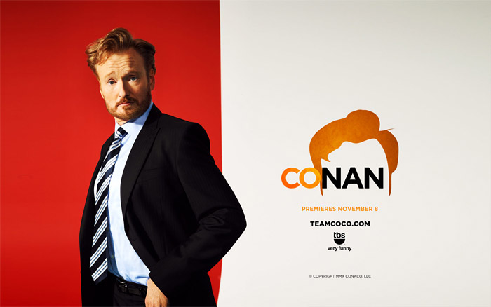
Conan O'Brien's new show, "Conan"
          I've been reading/looking through the idsgn blog recently, and came upon a entry upon the new logo designs for Conan O'Brien's new show on TBS called, "Conan." I noticed how they used salient characteristics of Conan O'Brien (his trademark red coif-like hair) to create a unique and easily memorable icon and designs. With that, the color scheme always utilizes orange because even the color has become a trademark.  What initially may have seemed to be a joke has manifested into a big campaign by fans celebrating his iconic red hair:

        What incited this campaign was the rivalry between Jay Leno and Conan Obrien after Leno had taken over The Tonight Show. It's interesting to see the simplicity and the creativity of the designs that convey an effective message about their support for "Coco."
The old and new design for his show.
        The new design of the logo is a great difference from the first logo. It is more ambiguous with the use of just one word "Conan" and one big image of Conan's iconic hair. I guess the objective of the new design was to be more direct and "in your face."  The simple black background alludes to the "tonight" show. The use of a small gradient makes the design more aesthetically pleasing and dynamic compared to the first logo, which is necessary because of the simplicity. It gives a different, more flashy mood. The first logo is more professional and aesthetically pleasing in terms of typography with the use of three different fonts. It emphasizes "The Tonight Show" more than the [former] host "Conan O'Brien," unlike the new logo that makes "Conan" the main focus.


Credits/Links:
[Coco's new 'do @idsgn.org] http://idsgn.org/posts/cocos-new-do/

GALAXY S

I've never cared too much about cellphones in the way that many teenagers and college students are so into what's new with cellphone technology in the iPhone, Blackberry, etc. Recently, my parents upgraded my old very reliable Nokia phone into a new smartphone called Galaxy S.  The past couple of days I've been able to play with it and explore its many different features. I can see the appeal of the Galaxy S through its thin and sleek design, as well as its high tech software and extra features. In my opinion, it’s much like an iPhone, except externally, it’s thinner, smaller, and has a slightly different arrangement of icons on the main screen. 
Samsung's Galaxy S
The Samsung Galaxy S is chockfull of specs that make it distinguishable among the smartphones and unique in its own way. It has a 4-inch multi-sensory touch screen with a Super AMOLED display that’s bright, clear, and anti-reflective so that it's visible even in the sunlight. The use of the Super AMOLED (Super Active-Matrix Organic Light-Emitting Diod) display is one of first of its kind in the cellphone market, which displays the innovation of the Samsung cellphone designers; the Super AMOLED display is ideal as it is a 20% brighter screen, 80% less sunlight reflection, and 20% reduced power consumption. This is an attractive part of the hardware because of the sustainability objective that all designers should strive to achieve. The Galaxy S also has an impressive 5-mega-pixel camera that does selective focus, has built-in photo effects, and is capable of recording video as well.
          The software and additional features of the Galaxy S make it a truly innovative phone. One feature that I really liked was the Swype capability, where when texting or typing anything on the on-screen keyboard, you can just swipe your fingers over the letters for each word (instead of typing each letter one-by-one) and the phone automatically inputs the word. It saves time for texting, which is already fast, but it allows you to work faster. Of course, you can access internet through this phone as that has become a staple in all smartphones. Another cool feature is the "AllShare" where you can play files from the phone to another player like a TV, play file from a server to the phone, or play file from a server to another player via the phone through a Wi-fi connection.
Galaxy S frontside
Galaxy S  backside
          The exterior of the Galaxy S is rather sexy because of the smooth, reflective surfaces of each sides of the phone. It is simple too, and produced only in one color--black, which makes it good for customizing. It is about the size of my palm and probably fits the normal hand perfectly (personally, it's a little too big for my short fingers but no biggie). Ergonomically, the rectangular shape of the phone does not feel ideal or comfortable when being held; I feel like this aspect of the design could have been changed or further explored upon to make it better fitted to the hand and less comparable to the iPhone phones. The thinness and weight of it, however, is a good thing because it does not make it feel like its bulky unlike other smartphones.
          Overall, the Galaxy S is a great and innovatively designed smartphone. It has set the bar higher for smartphones everywhere.

Credit/Links:

Monday, November 8, 2010

Dave McKean

Stills from his movie, MirrorMask
          Professor Housefield has talked about how important it is to find your very own creative voice, which can take a long time to develop but it'll set you apart from all the other designers out there. Brian Fies was able to find his through Mom's Cancer and he was a late blooming cartoonist. One artist that I know will, or is already, influence my creative voice
          Dave McKean has been an artist that I've learned to admire ever since I started reading Neil Gaiman's works, who, by the way, is one of my favorite authors. He is an established and successful illustrator of books and comic books (he illustrated The Sandman covers), filmmaker and graphic designer (he directed MirrorMask), and musician. Talk about being an all around artist!
          It is amazing to find people so passionate about something to the point that it's so apparent. His distinguishable style is derived from surrealism. He combines contrasting


CREDIT/LINKS:
[Info about Dave McKean] http://www.allenspiegelfinearts.com/mckean.html
[Stills from MirrorMask]

[IMBD: MirrorMask] http://www.imdb.com/title/tt0366780/

Words & Images: PETA's Vegan College Cookbook


          In Brian Fies' lecture last week, he showed us how he had to go through hundreds of different designs to find the right cover for Mom's Cancer when it was being published into a book. It shows how in comics and in design, first impressions are important because it's what a customer sees first and it is the determining factor, out of all the books in a bookstore, that makes a customer want to pick it up or not.
          My last birthday, I received a cookbook from a friend that I had always wanted to get. It was PETA's Vegan College Cookbook. The cover is definitely an attention grabber with its simple layout and color scheme. The olive green, blues, and pink colors really work well and compliment eachother and give a friendly feeling because they are not overbearing. The simple layout of the cover reflect the "easy" concept of the cookbook, in terms of comprehension and the recipes themselves.

Credit/Links:
[PETA book cover design] http://www.addebook.com/biomed/html/foods-nutrition/cookbookrecipespetas-vegan-college-cookbook-275-easy-cheap-and-delicious-recipes-to-keep-you-vegan-at-school_23318.html

Words & Images: Mom's Cancer by Brian Fies

Mom's Cancer by Brian Fies
          Last Tuesday, Brian Fies, the cartoonist who created Mom's Cancer and Whatever Happened to the World of Tomorrow? came to DES 001 and gave us a lecture. He told us about the whole process of how he created Mom's Cancer and the story behind it. It was immensely inspiring to hear his story and how, unintentionally, he was able to create the great adversity that his family had to endure, into something that so many people are able to relate to thus making his comic so successful.
A panel from Mom's Cancer website
          Brian Fies' Mom's Cancer show how words and images interact and work together, through allusion, to convey a concept. The interaction between words and images is a powerful one as it gives meaning to the comic. If words or images were on their own, they wouldn't be as powerful in conveying a message, especially such themes of family, death, cancer, etc. that are touched upon in Mom's Cancer. Fies comments that his comic played between the lines of ridiculous and serious, which in a way reflects how words and images play a role in illustrating Fies' style; he used some dialogue from his own experiences, which are mostly serious, and he used image to portray his own imagination, which was sometimes literal or comedic, to add a little humor to a very serious and personal part of his life. He even added color to some panels to depict a different emotion or mood, in contrast to the overall seriousness of the comic. Words and images are a powerful medium not only for comic readers, but also an expressive medium for the illustrator and writer.

A Panel from Mom's Cancer website.

          When Fies spoke more technically about the creation of each panel of the comic, I found it interesting to see how words were the most important aspect; so words are put in first, and then the art/image is worked around them. It makes sense because it is the words that guide the reader and expresses a more specific message. It makes me think of advertisement design and how art is not enough when imparting a concept because communicating a message is what's important. You have to use the combination of words and images to do this. Though concept is the most important part of a design, it can never be imparted correctly without the medium of words and image.

Credit/Links:
[Brian Fies' blog] http://brianfies.blogspot.com/
[all images/panels] http://www.momscancer.com/
[Buy Mom's Cancer on Amazonhttp://www.amazon.com/Moms-Cancer-Brian-Fies/dp/0810958406

Tuesday, November 2, 2010

Mugged

          Like the objects in the first couple of minutes of the film in Objectified that are handled by many people during their morning routines, mugs fit the same category of mass-produced objects of industrial design. Mugs are an essential part of the daily lives of many people; it holds their drinks and food even (I put eat my cereal in them!) at the very least, and others find other creative ways of using them.
The typical mug.
            The archetypal form of a mug can be described as a white porcelain cup with a handle. Even as a mug, it still derives itself from a cup. It has a circular bottom thus taking a cylindrical shape. Its lines are not sharp, but not exactly curved. Its edges are tapered just enough so that it's still comfortable for holding in your hands and for putting your lips on. In contrast to its cylindrical shape and also a salient characteristic that differentiates it from any regular cup, it has a handle juts out to an oval shape. There is still continuity in the circles between the handle and the base.  Its simple and prime function is to hold hot beverages. Surprisingly, it is not a object that is looked over. More than likely, you will see decorated mugs more than plain ones, but they all have the same general shape.
Moustache mugs by Peter Ibruegger
          Decorated mugs are a big part of our culture. It's one way society self expresses itself most evidently. It has so much blank space on its surface that we are compelled to personalize it to our liking with many different graphics. Some more ambitious and creative people like to alter it a bit more by creating new handles:
Frustration mug
Brass Knuckle mug on Fredflare

Or  altering its main body:
Totem pole mug on Fredflare
         There are many clever and creative ways to personalize mugs to one's fancy. Mugs are an example of a good design because its simplicity allows so much freedom for creativity. In the words of Paola Antonelli (IKEA) who was featured in Objectified, "democratization of design should not exist."

Credit/Link:
Photos
 -[Typical mug] http://askville.amazon.com/Askville-Mug/AnswerViewer.do?requestId=8585480
 -[Mustache mug] http://www.peteribruegger.com/index.php?/new-product/moustache-moods/
 -[Brass knuckle mug] http://www.fredflare.com/customer/product.php?productid=5241&cat=254
 -[Frustration mug] http://www.community-credit.com/cs/blogs/community_credit_news/archive/2006/12.aspx
 -[Totem pole mug] http://www.fredflare.com/customer/product.php?productid=5579&cat=254

Monday, November 1, 2010

OBJECTIFIED: form & content

          Last Thursday, we watched a film about design during the second half of DES001. In the documentary film, Objectified, one of the designers in the movie (who's name I couldn't jot down fast enough) described three phases that a design usually goes through in order to realize some kind of meaningful function. The three phases are form, symbolism and content, and contextual sense. In this blog, I want to focus on how form and content interact in design.
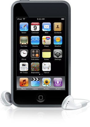
         One of the designers that I was able to jot down was Jane Fulton Suri, a chief creative officer from IDEO, a global design firm; she saw designers as being capable of being "culture generators," and that "they design scenarios based on objects to see the consequences of their choices." In the process of designing things, form is the constraints of the content of a design in the physical world. Designers indirectly influence popular culture by taking certain concepts/content and making them real in many different forms. A very good example of a company that advocates good design explored by the film is Apple, because they think so innovatively. Jonathan Ive, a senior VP at Apple, asks such questions as"why is it like that and not like this???"  when they looks at products, including their own. He emphasizes how you, as the client or the targeted audience, have to connect with the product. The main content of their products are interaction design and with that, they like to continue that concept with its form. For example, the iPod touch and Macbook Pro have a smooth, stylish, sophisticated, yet simple design to reflect the user friendly interface and sophisticated software inside. The simplicity of their physical form makes it more universal because it looks more approachable and appealing. It can be easily personalized, and it has no particular target audience.
MacBook Pro
Ipod Touch
          The quality of their forms, from the Macbooks aluminum body and the iPod Touch's stainless steel back and glass screen, reflects the quality of the software. This is why Apple is revered for having good design in a lot of their products, when form and content meet on the same level.


Credits/Links:
[Objectified film by Gary Hustwit] http://www.objectifiedfilm.com/
[Info about Jane Fulton Suri] http://www.ideo.com/people/jane-fulton-suri
[Info about IDEO] http://www.ideo.com/about/
[Macbook pro] http://www.komplettblog.ie/tag/macbook-pro/
[Ipod Touch] http://www.techerator.com/2009/11/comparison-motorola-droid-vs-ipod-touch/

Monday, October 18, 2010

Ephemeral Design


          During the lectures in Design 1, Professor Housefield mentioned ephemeral design many times in relation to Andy Goldsworthy's work. I was not introduced to his work before so I was amazed upon seeing them. His medium is nature: he uses leaves, sticks, petals, flowers, stones, etc. to create his artworks. It makes one wonder, "Why? What's the point in making art that doesn't last?" In this blog I want to compare two opposite spectrum of what is considered "ephemeral art and/or design" with Andy Goldsworthy and street art. In the video above, Goldsworthy works to create a work where he connects sticks/twigs together from a tree. His design's focal point is on a circular hole that was rendered by connecting the sticks closer together so that it appears as if it's what's holding the piece together, though that's only true aesthetically.
          This is a video entitled "One Week of Japanese Art" that I watched about 3 years ago that inspired me greatly.

The changing Japanese street art mural in the video was recorded over the span of a week. This differs from Goldsworthy's work because it is a collective project by multiple artists who added and subtracted different designs to the mural. In between the different murals, there were transitions that revealed the focal points of each design, and each focal point created a connection between the changing murals so they all flowed smoothly with unity.
          Ephemeral art seems more sacred and important just the way it is, because it's only there for a limited amount of time; it adds a certain value to a work that even money can't buy. This type of art is fleeting and can never be replicated exactly the way it was.

Credits/Links:
Youtube
[More on Andy Goldsworthy]: http://www.morning-earth.org/artistnaturalists/an_goldsworthy.html

Design, c'est une conversation

          Generally speaking, I'm sure it's safe to say that design is a universal conversation. It can represent, show, include, and reflect what is important to people's lives in society. As I've mentioned in a previous blog, it can illustrate the zeitgeist of modern culture and society through the evolution of iconography and other elements of design. We watched a part of a video essay in Design 1 last week that interviewed Charles and Ray Eames on design. It explained, in the simplest and most honest of terms, that design tries to find solutions to problems. With that said, it's apparent that the conversation of design is between society--the whole multitude.
          Nowadays, sustainability or the "green" initiative is popular in today's culture because we have become self-conscious about our carbon footprint and concerned about the condition of the environment we live in. We have realized how pollution, depletion of natural resources, and waste from humans is ultimately, directly and indirectly, affecting other people, our children in the future, and nature. It's a grand cycle that is being resolved through the efforts of people and sustainable design. IKEA is a well known company that tackles this challenge of sustainable furniture design, paired with affordable prices, to meet the problems of today's society. This is the conversation of design in action through sustainability.
FILLSTA (floor lamp) $69.99
POÄNG chair ($99)
IKEA PS KARLJOHAN table ($59.99)

          Their designs for furniture, among other things, are very innovative. They have always been a step ahead of the game. They managed to create furniture that is stylish, simplistic, and practical with the constraints of sustainability. Surprisingly, the quality and aesthetics of their furniture designs don't seem to lack through these constraints.They have a thorough sustainability report from 2009 that shows how much work they put into sustainability with their products and their own manufacturing. It's refreshing to see companies like this who make it part of their standard to include sustainability, safety, and quality in their products.
       IKEA's sustainable designs are a response to society's concern with the environment. In this way, design holds a conversation between the environment, science, and ethics.

Credit/Links:
Charles and Ray Eames: http://designmuseum.org/design/charles-ray-eames
[IKEA Sustainability Report 2009 PDF]: http://www.ikea.com/ms/en_US/about_ikea/pdf/sustainability_Report_2009.pdf (7.14MB)

[IKEA FILLSTA floor lamp]: http://www.ikea.com/us/en/catalog/products/00155006
[IKEA POÄNG chair]: http://www.ikea.com/us/en/catalog/products/00155780
[IKEA PS KARLJOHAN table]: http://www.ikea.com/us/en/catalog/products/10149939

Tuesday, October 12, 2010

iTunes logo

          In class today, Professor Housefield mentioned the article about the release of the Gap logo change last week which produced a lot of negative feedback. I noticed, upon reading the comments on the article, that there are many people who did not care or see the importance of it. The Gap logo is iconic. I remember the logo the way it has been since I can remember, and I know that it's is older than I am. It's surprising to see how commercial icons like Gap affect society today, which reinstates what we've been studying in Design 1 on how "image is power!" The dramatic change from the older, more sophisticated logo to one that "looks as if it were done in Microsoft Word," stirred up a lot of people. Fortunately, the Gap logo has been changed back to its original now, and the world seems to be a little more peaceful. It goes to show how the iconography and aesthetics have the power to move people, change the way they think, and incite change.
         Last month, I downloaded the upgrade for iTunes 10 and noticed that they changed the default icon to a design in which the musical note is now black inside a blue circle. It is no longer has the simple blue/green musical note placed in front of a CD-design. The radial gradient from a blue to a cyan in the new icon is appealing and cool compared to the plain image of a CD, but I have yet to get used to it. I miss the simplicity of the old designs, but I don't necessarly dislike the new one either.


          Even the subtle changes between the emerald green music note and the blue music note were considerably noticeable to me. I feel like I had to rewire my brain to get used to the changes. It seems that at times, the human brain rejects change automatically unless the new change is more aesthetically appealing. It's fascinating to see the evolution of icons throughout the years and how it changes with technology. I know Apple's decision to change the icon was driven by the coming obsolescence of CDs because music can be easily purchased digitally nowadays. The "out with the old, in with the new" mentality is applicable to iconography, but at least the same elements (the music note and circle shape) stayed with the icon through its evolution.

Gap logo article (October 7th): 
http://finance.yahoo.com/family-home/article/110957/gap-changes-logo-why?mod=family-kids_parents
Gap's logo article (October 12th): http://finance.yahoo.com/news/Gaps-logo-back-to-blue-after-apf-3578440916.html?x=0
[image] New iTunes icon: http://www.wired.com/gadgetlab/2010/09/steve-jobs-itunes/
[image] Old iTunes icon (blue): http://www.techdigest.tv/apple/3.html
[image] Old iTunes icon (green): http://www.pcadvisor.co.uk/blogs/index.cfm?blogId=4&entryId=106517

Monday, October 11, 2010

Jerry Uelsmann: Creativity from Within

"Untitled" 1981 by Jerry Uelsmann

Jerry Uelsmann is one of my favorite photographers and I have so much respect for him because of his patience, dedication, passion, and unique style in photography. He exemplifies creativity from within in his surrealistic photographs that takes the viewer into another world.  He designs his photographs from all the images that he has taken. It's intriguing to think about how his mind goes about the creative process when working on an image where he remembers a photograph he might have taken years ago that would fit perfectly into the image that he's working on. I watched an interview of him describing that, and he explained how he would have to go find that negative out of the hundreds, or thousands, of pictures he has taken. 
          Jerry Uelsmann is an American photographer who specializes in analog/film photography. He spends hundreds of hours in the darkroom, using multiple negatives and enlargers, to create just one image. His works seem so flawless and it's impressive how he practiced solely on analog photography to create his artworks. He was able to manipulate photographs even before the age of Adobe Photoshop. It's apparent that his work is time extensive and can take hours, days, and weeks for him to be satisfied with what he has created. While nowadays the type of photography he creates can be done in much shorter time on Adobe Photoshop, he still plays in the darkroom. He’s a true artist of photography and designer in my eyes. 
          His patience, dedication, and passion to make just one beautiful print displays how much hard work is put in to works of art. In the world of commercialized art and design, we often overlook or take no notice of the products and artwork around us and how they affect us. We as human beings are really privileged to live in a world full of art and design, but at the same time, designers and artists are obligated, by their mere nature, to reveal the beauty of the world through their imagination from within and from outside themselves. We should learn to see through the eyes of a designer and learn to appreciate art and design in society because it will transcend our lifetimes and inspire people in the future.
"Untitled" 1975 by Jerry Uelsmann

Credit/Links:
More about Jerry Uelsmann: http://www.uelsmann.com/
 http://pdngallery.com/legends/uelsmann/
[images] http://www.masters-of-photography.com/U/uelsmann/uelsmann.html

Creativity from Without

Inspiration is sometimes abundant and there are times where it’s just hard to find. Creativity, though, it is something that is always there... ready to pave the way for inspiration. Creativity from without can be achieved as simply as going outside for a walk, observing and taking in all your surroundings. No matter where a person is, in the small town of Davis or urban jungle of New York City, there is potential for inspiration if you look deep or creatively enough around you.
                Finding creativity from without allows a designer to interact and connect with nature, the natural human world (which includes manmade structures), and people through those means. Being in tune with the movement, colors, shapes, and sounds of the world around us allows creativity to flourish before our eyes. We see and feel the sleek and rough textures, smooth and jagged edges, and geometric shapes all around that pleases the mind in its complexity. I use photography, like many, to achieve creativity from without. There is beauty in everything. I like to approach creativity in a minimalistic way from capturing clear skies to show the shape of birds on telephone lines, intricate branches of tumbleweed to convey movement, an lost feeling through a small tube, cracks and raindrops on desert crust that looks like a different sort of sky, a reflective shadow, and the like. Sometimes all a person need to do is go outside, walk around, observe, and find ways to be creative with the world around you; find a connection. 
Birds on telephone lines on a clear day

Tumble weed

Another kind of sky.

Small tube.

Shadow looking in.

Intricate framework of a telephone pole.
Credits/Links:
[images] Kimberly Losenara

Stone Soup: A Christmas Tree!

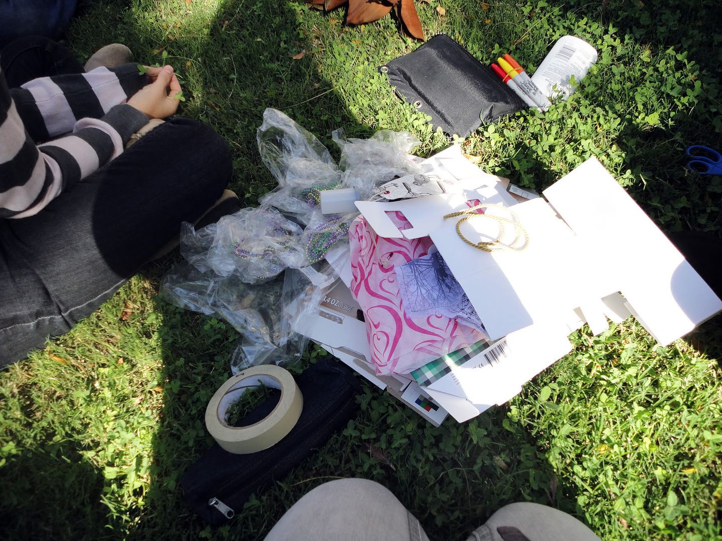
  Stone Soup: one of those seemingly irrelevant topics (to Design) that designers like Michael Bierut* talk about. I was introduced to the story by Marcia Brown* in my Design class last week, and on Thursday, we were able to create our own kind of soup/artwork through collective teamwork just like in the book. Professor Housefield asked us to bring some objects that can be used to make an artwork in our groups. I brought a couple of materials such as Mardi gras beads from French club in high school, cereal boxes, random clothes tags, and scrap paper.
The "stuff" that I brought.

Putting things together.
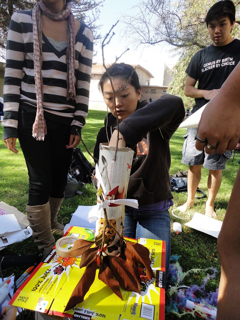
So we went outdoors and started our “work of art.” At first we didn’t know what to create, so individually we just started putting things together, then we began to fit and add pieces together from what we made into one whole piece. Our hands working together formed a sort of Christmas tree in the way we had different sorts of objects dangling from its branches. We also used a lot of tree branches and bark to add a realistic element and texture to our overall artwork. Though we were not able to execute all our ideas for the project, we did the best we could to include an idea from each person. It made me re-realize how hard it is to work in a group where ideas often clash because I’m sure we all had a different vision for it. Communication is a key component in the design world. I feel that we were all able to contribute an idea or two into the project. In the end, we came up with an interesting, somewhat abstract Christmas tree, but more importantly, we bonded.
Making holes on the tree for the branches.
The final result!
Seeing what the other groups made was interesting as well. It revealed to me the relationship between teamwork and artwork, how the quality of communication between the group members is reflected on the design. The better the communication, the clearer the ideas are portrayed in a design.

Credit/links:
Michael Bierut: http://www.pentagram.com/en/partners/michael-bierut.php

Monday, October 4, 2010

OBEY

                The world of street art in urban jungles has interested me profoundly after I started reading the Wooster Collective blog. I found that there is more to street art than graffiti and profane messages. It goes deeper than that. It’s like an underground portal of magic and mystery where youth and creative intellectuals use street art as medium to convey thought provoking messages that make you question yourself, your beliefs, and your existence. Though the messages may not always be positive, they are honest. They never force beliefs either; they let you interpret the drawings, images, and words yourself. Who would have thought that a simple graphic can invoke such strong ideas and be interpreted in so many ways?
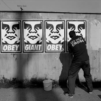
Shepard Fairey in an Elizabeth Daniels portrait
               The André the Giant icon and OBEY slogan is part of a street art anti-propaganda campaign started by Shepard Fairey in 1989 in Rhode Island. Since then, it has become so popular that today you can find his stickers, t-shirts, stencils, etc. in every country. Fairey has transformed the image of André the icon into a distinguishable icon. Fairey said that “the sticker has no meaning but exists only to cause people to react, to contemplate and search for meaning in the sticker. Because OBEY has no actual meaning, the various reactions and interpretations of those who view it reflect their personality and the nature of their sensibilities.” It’s fascinating how Fairey’s design has manifested itself. It demonstrates the power of iconic art, and how it affects people universally. 

Links/Credit:
www.woostercollective.com
www.obeygiant.com
[image] http://www.thegiant.org/wiki/index.php/Obey_Giant