Monday, October 18, 2010
Ephemeral Design
During the lectures in Design 1, Professor Housefield mentioned ephemeral design many times in relation to Andy Goldsworthy's work. I was not introduced to his work before so I was amazed upon seeing them. His medium is nature: he uses leaves, sticks, petals, flowers, stones, etc. to create his artworks. It makes one wonder, "Why? What's the point in making art that doesn't last?" In this blog I want to compare two opposite spectrum of what is considered "ephemeral art and/or design" with Andy Goldsworthy and street art. In the video above, Goldsworthy works to create a work where he connects sticks/twigs together from a tree. His design's focal point is on a circular hole that was rendered by connecting the sticks closer together so that it appears as if it's what's holding the piece together, though that's only true aesthetically.
This is a video entitled "One Week of Japanese Art" that I watched about 3 years ago that inspired me greatly.
The changing Japanese street art mural in the video was recorded over the span of a week. This differs from Goldsworthy's work because it is a collective project by multiple artists who added and subtracted different designs to the mural. In between the different murals, there were transitions that revealed the focal points of each design, and each focal point created a connection between the changing murals so they all flowed smoothly with unity.
Ephemeral art seems more sacred and important just the way it is, because it's only there for a limited amount of time; it adds a certain value to a work that even money can't buy. This type of art is fleeting and can never be replicated exactly the way it was.
Credits/Links:
Youtube
[More on Andy Goldsworthy]: http://www.morning-earth.org/artistnaturalists/an_goldsworthy.html
Design, c'est une conversation
Generally speaking, I'm sure it's safe to say that design is a universal conversation. It can represent, show, include, and reflect what is important to people's lives in society. As I've mentioned in a previous blog, it can illustrate the zeitgeist of modern culture and society through the evolution of iconography and other elements of design. We watched a part of a video essay in Design 1 last week that interviewed Charles and Ray Eames on design. It explained, in the simplest and most honest of terms, that design tries to find solutions to problems. With that said, it's apparent that the conversation of design is between society--the whole multitude.
Nowadays, sustainability or the "green" initiative is popular in today's culture because we have become self-conscious about our carbon footprint and concerned about the condition of the environment we live in. We have realized how pollution, depletion of natural resources, and waste from humans is ultimately, directly and indirectly, affecting other people, our children in the future, and nature. It's a grand cycle that is being resolved through the efforts of people and sustainable design. IKEA is a well known company that tackles this challenge of sustainable furniture design, paired with affordable prices, to meet the problems of today's society. This is the conversation of design in action through sustainability.
Their designs for furniture, among other things, are very innovative. They have always been a step ahead of the game. They managed to create furniture that is stylish, simplistic, and practical with the constraints of sustainability. Surprisingly, the quality and aesthetics of their furniture designs don't seem to lack through these constraints.They have a thorough sustainability report from 2009 that shows how much work they put into sustainability with their products and their own manufacturing. It's refreshing to see companies like this who make it part of their standard to include sustainability, safety, and quality in their products.
IKEA's sustainable designs are a response to society's concern with the environment. In this way, design holds a conversation between the environment, science, and ethics.
Credit/Links:
Charles and Ray Eames: http://designmuseum.org/design/charles-ray-eames
[IKEA Sustainability Report 2009 PDF]: http://www.ikea.com/ms/en_US/about_ikea/pdf/sustainability_Report_2009.pdf (7.14MB)
[IKEA FILLSTA floor lamp]: http://www.ikea.com/us/en/catalog/products/00155006
[IKEA POÄNG chair]: http://www.ikea.com/us/en/catalog/products/00155780
[IKEA PS KARLJOHAN table]: http://www.ikea.com/us/en/catalog/products/10149939
Nowadays, sustainability or the "green" initiative is popular in today's culture because we have become self-conscious about our carbon footprint and concerned about the condition of the environment we live in. We have realized how pollution, depletion of natural resources, and waste from humans is ultimately, directly and indirectly, affecting other people, our children in the future, and nature. It's a grand cycle that is being resolved through the efforts of people and sustainable design. IKEA is a well known company that tackles this challenge of sustainable furniture design, paired with affordable prices, to meet the problems of today's society. This is the conversation of design in action through sustainability.
 |
| FILLSTA (floor lamp) $69.99 |
 |
| POÄNG chair ($99) |
 |
| IKEA PS KARLJOHAN table ($59.99) |
Their designs for furniture, among other things, are very innovative. They have always been a step ahead of the game. They managed to create furniture that is stylish, simplistic, and practical with the constraints of sustainability. Surprisingly, the quality and aesthetics of their furniture designs don't seem to lack through these constraints.They have a thorough sustainability report from 2009 that shows how much work they put into sustainability with their products and their own manufacturing. It's refreshing to see companies like this who make it part of their standard to include sustainability, safety, and quality in their products.
IKEA's sustainable designs are a response to society's concern with the environment. In this way, design holds a conversation between the environment, science, and ethics.
Credit/Links:
Charles and Ray Eames: http://designmuseum.org/design/charles-ray-eames
[IKEA Sustainability Report 2009 PDF]: http://www.ikea.com/ms/en_US/about_ikea/pdf/sustainability_Report_2009.pdf (7.14MB)
[IKEA FILLSTA floor lamp]: http://www.ikea.com/us/en/catalog/products/00155006
[IKEA POÄNG chair]: http://www.ikea.com/us/en/catalog/products/00155780
[IKEA PS KARLJOHAN table]: http://www.ikea.com/us/en/catalog/products/10149939
Tuesday, October 12, 2010
iTunes logo
In class today, Professor Housefield mentioned the article about the release of the Gap logo change last week which produced a lot of negative feedback. I noticed, upon reading the comments on the article, that there are many people who did not care or see the importance of it. The Gap logo is iconic. I remember the logo the way it has been since I can remember, and I know that it's is older than I am. It's surprising to see how commercial icons like Gap affect society today, which reinstates what we've been studying in Design 1 on how "image is power!" The dramatic change from the older, more sophisticated logo to one that "looks as if it were done in Microsoft Word," stirred up a lot of people. Fortunately, the Gap logo has been changed back to its original now, and the world seems to be a little more peaceful. It goes to show how the iconography and aesthetics have the power to move people, change the way they think, and incite change.
Last month, I downloaded the upgrade for iTunes 10 and noticed that they changed the default icon to a design in which the musical note is now black inside a blue circle. It is no longer has the simple blue/green musical note placed in front of a CD-design. The radial gradient from a blue to a cyan in the new icon is appealing and cool compared to the plain image of a CD, but I have yet to get used to it. I miss the simplicity of the old designs, but I don't necessarly dislike the new one either.


Even the subtle changes between the emerald green music note and the blue music note were considerably noticeable to me. I feel like I had to rewire my brain to get used to the changes. It seems that at times, the human brain rejects change automatically unless the new change is more aesthetically appealing. It's fascinating to see the evolution of icons throughout the years and how it changes with technology. I know Apple's decision to change the icon was driven by the coming obsolescence of CDs because music can be easily purchased digitally nowadays. The "out with the old, in with the new" mentality is applicable to iconography, but at least the same elements (the music note and circle shape) stayed with the icon through its evolution.
Gap logo article (October 7th): http://finance.yahoo.com/family-home/article/110957/gap-changes-logo-why?mod=family-kids_parents
Gap's logo article (October 12th): http://finance.yahoo.com/news/Gaps-logo-back-to-blue-after-apf-3578440916.html?x=0
[image] New iTunes icon: http://www.wired.com/gadgetlab/2010/09/steve-jobs-itunes/
[image] Old iTunes icon (blue): http://www.techdigest.tv/apple/3.html
[image] Old iTunes icon (green): http://www.pcadvisor.co.uk/blogs/index.cfm?blogId=4&entryId=106517
Last month, I downloaded the upgrade for iTunes 10 and noticed that they changed the default icon to a design in which the musical note is now black inside a blue circle. It is no longer has the simple blue/green musical note placed in front of a CD-design. The radial gradient from a blue to a cyan in the new icon is appealing and cool compared to the plain image of a CD, but I have yet to get used to it. I miss the simplicity of the old designs, but I don't necessarly dislike the new one either.
Even the subtle changes between the emerald green music note and the blue music note were considerably noticeable to me. I feel like I had to rewire my brain to get used to the changes. It seems that at times, the human brain rejects change automatically unless the new change is more aesthetically appealing. It's fascinating to see the evolution of icons throughout the years and how it changes with technology. I know Apple's decision to change the icon was driven by the coming obsolescence of CDs because music can be easily purchased digitally nowadays. The "out with the old, in with the new" mentality is applicable to iconography, but at least the same elements (the music note and circle shape) stayed with the icon through its evolution.
Gap logo article (October 7th): http://finance.yahoo.com/family-home/article/110957/gap-changes-logo-why?mod=family-kids_parents
Gap's logo article (October 12th): http://finance.yahoo.com/news/Gaps-logo-back-to-blue-after-apf-3578440916.html?x=0
[image] New iTunes icon: http://www.wired.com/gadgetlab/2010/09/steve-jobs-itunes/
[image] Old iTunes icon (blue): http://www.techdigest.tv/apple/3.html
[image] Old iTunes icon (green): http://www.pcadvisor.co.uk/blogs/index.cfm?blogId=4&entryId=106517
Monday, October 11, 2010
Jerry Uelsmann: Creativity from Within
 |
| "Untitled" 1981 by Jerry Uelsmann |
Jerry Uelsmann is one of my favorite photographers and I have so much respect for him because of his patience, dedication, passion, and unique style in photography. He exemplifies creativity from within in his surrealistic photographs that takes the viewer into another world. He designs his photographs from all the images that he has taken. It's intriguing to think about how his mind goes about the creative process when working on an image where he remembers a photograph he might have taken years ago that would fit perfectly into the image that he's working on. I watched an interview of him describing that, and he explained how he would have to go find that negative out of the hundreds, or thousands, of pictures he has taken.
Jerry Uelsmann is an American photographer who specializes in analog/film photography. He spends hundreds of hours in the darkroom, using multiple negatives and enlargers, to create just one image. His works seem so flawless and it's impressive how he practiced solely on analog photography to create his artworks. He was able to manipulate photographs even before the age of Adobe Photoshop. It's apparent that his work is time extensive and can take hours, days, and weeks for him to be satisfied with what he has created. While nowadays the type of photography he creates can be done in much shorter time on Adobe Photoshop, he still plays in the darkroom. He’s a true artist of photography and designer in my eyes.
His patience, dedication, and passion to make just one beautiful print displays how much hard work is put in to works of art. In the world of commercialized art and design, we often overlook or take no notice of the products and artwork around us and how they affect us. We as human beings are really privileged to live in a world full of art and design, but at the same time, designers and artists are obligated, by their mere nature, to reveal the beauty of the world through their imagination from within and from outside themselves. We should learn to see through the eyes of a designer and learn to appreciate art and design in society because it will transcend our lifetimes and inspire people in the future.
 |
| "Untitled" 1975 by Jerry Uelsmann |
More about Jerry Uelsmann: http://www.uelsmann.com/
http://pdngallery.com/legends/uelsmann/
[images] http://www.masters-of-photography.com/U/uelsmann/uelsmann.html
Creativity from Without
Inspiration is sometimes abundant and there are times where it’s just hard to find. Creativity, though, it is something that is always there... ready to pave the way for inspiration. Creativity from without can be achieved as simply as going outside for a walk, observing and taking in all your surroundings. No matter where a person is, in the small town of Davis or urban jungle of New York City, there is potential for inspiration if you look deep or creatively enough around you.
Finding creativity from without allows a designer to interact and connect with nature, the natural human world (which includes manmade structures), and people through those means. Being in tune with the movement, colors, shapes, and sounds of the world around us allows creativity to flourish before our eyes. We see and feel the sleek and rough textures, smooth and jagged edges, and geometric shapes all around that pleases the mind in its complexity. I use photography, like many, to achieve creativity from without. There is beauty in everything. I like to approach creativity in a minimalistic way from capturing clear skies to show the shape of birds on telephone lines, intricate branches of tumbleweed to convey movement, an lost feeling through a small tube, cracks and raindrops on desert crust that looks like a different sort of sky, a reflective shadow, and the like. Sometimes all a person need to do is go outside, walk around, observe, and find ways to be creative with the world around you; find a connection.
 |
| Birds on telephone lines on a clear day |
 |
| Tumble weed |
 |
| Another kind of sky. |
 |
| Small tube. |
 |
| Shadow looking in. |
 |
| Intricate framework of a telephone pole. |
Credits/Links:
[images] Kimberly Losenara
[images] Kimberly Losenara
Stone Soup: A Christmas Tree!
Stone Soup: one of those seemingly irrelevant topics (to Design) that designers like Michael Bierut* talk about. I was introduced to the story by Marcia Brown* in my Design class last week, and on Thursday, we were able to create our own kind of soup/artwork through collective teamwork just like in the book. Professor Housefield asked us to bring some objects that can be used to make an artwork in our groups. I brought a couple of materials such as Mardi gras beads from French club in high school, cereal boxes, random clothes tags, and scrap paper.
So we went outdoors and started our “work of art.” At first we didn’t know what to create, so individually we just started putting things together, then we began to fit and add pieces together from what we made into one whole piece. Our hands working together formed a sort of Christmas tree in the way we had different sorts of objects dangling from its branches. We also used a lot of tree branches and bark to add a realistic element and texture to our overall artwork. Though we were not able to execute all our ideas for the project, we did the best we could to include an idea from each person. It made me re-realize how hard it is to work in a group where ideas often clash because I’m sure we all had a different vision for it. Communication is a key component in the design world. I feel that we were all able to contribute an idea or two into the project. In the end, we came up with an interesting, somewhat abstract Christmas tree, but more importantly, we bonded.
Seeing what the other groups made was interesting as well. It revealed to me the relationship between teamwork and artwork, how the quality of communication between the group members is reflected on the design. The better the communication, the clearer the ideas are portrayed in a design.
Credit/links:
Michael Bierut: http://www.pentagram.com/en/partners/michael-bierut.php
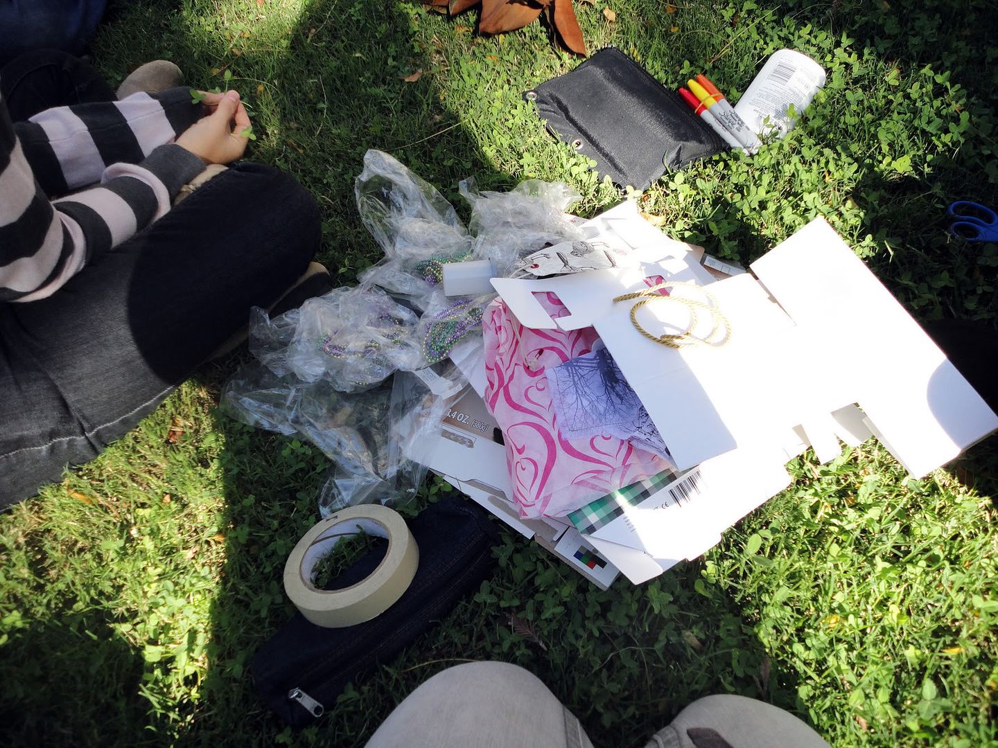 |
| The "stuff" that I brought. |
 |
| Putting things together. |
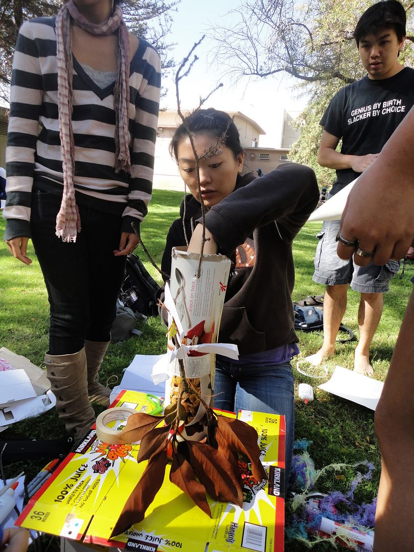 |
| Making holes on the tree for the branches. |
 |
| The final result! |
Credit/links:
Michael Bierut: http://www.pentagram.com/en/partners/michael-bierut.php
Monday, October 4, 2010
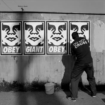
OBEY
The world of street art in urban jungles has interested me profoundly after I started reading the Wooster Collective blog. I found that there is more to street art than graffiti and profane messages. It goes deeper than that. It’s like an underground portal of magic and mystery where youth and creative intellectuals use street art as medium to convey thought provoking messages that make you question yourself, your beliefs, and your existence. Though the messages may not always be positive, they are honest. They never force beliefs either; they let you interpret the drawings, images, and words yourself. Who would have thought that a simple graphic can invoke such strong ideas and be interpreted in so many ways?
 |
| Shepard Fairey in an Elizabeth Daniels portrait |
The André the Giant icon and OBEY slogan is part of a street art anti-propaganda campaign started by Shepard Fairey in 1989 in Rhode Island. Since then, it has become so popular that today you can find his stickers, t-shirts, stencils, etc. in every country. Fairey has transformed the image of André the icon into a distinguishable icon. Fairey said that “the sticker has no meaning but exists only to cause people to react, to contemplate and search for meaning in the sticker. Because OBEY has no actual meaning, the various reactions and interpretations of those who view it reflect their personality and the nature of their sensibilities.” It’s fascinating how Fairey’s design has manifested itself. It demonstrates the power of iconic art, and how it affects people universally.
Links/Credit:
www.woostercollective.com
www.obeygiant.com
[image] http://www.thegiant.org/wiki/index.php/Obey_Giant
www.obeygiant.com
[image] http://www.thegiant.org/wiki/index.php/Obey_Giant
Respect for the Dead
While reading Scott McCloud's "Understanding Comics," McCloud brought up a great point about how the design of comics revealed the differences in cultures of eastern and western civilizations:
"Traditional western art and literature don't wander much. On the whole, we're pretty goal-oriented culture. But, in the east, there's a rich tradition of cyclical and labyrinthine works of art. Japanese comics may be heirs to this tradition, in the way they so often emphasize being there over getting there." (Understanding Comics by Scott McCloud, page 81)
Looking at the big picture, it made me realize how much design and art reflects different cultures, as well as zeitgeist.
This past weekend, I visited Fresno with a friend and we spontaneously decided to go see the Arte Américas: Casa de la Cultura art gallery. I noticed how a prominent theme in Mexican folk art is the Los Dias De Los Muertos (Day of the Dead). Often in these works, vibrant colors would be used on a black canvas (instead of white) and illustrate skeletons of people dressed in traditional Mexican costumes. The vibrant colors on black created an fluorescent effect that really grabs a person's attention. The paintings I saw were beautifully haunting-- the way the skeletons were so full of life, even though they were dead.
It's interesting to see how the Hispanic culture is so engaged in life after death that their traditions resonate through art and design. It gives the outside world a look into how they have elevated respect for the dead and for their history. In this way, we see how art becomes a design because it has a purpose.
links/credit:
Understanding Comics by Scott McCloud
http://arteamericas.org/index.html (Arte Américas: Casa de la Cultura)
[1st picture] Google Images: http://weblogs.clarin.com/revistaenie-testigoocular/archives/2008/10/ (Diego Rivera's "Dia de los muertos")
[2nd picture] http://community.adn.com/node/133849 (Article about Day of the Day in San Miguel Allende, Mexico 2008)
"Traditional western art and literature don't wander much. On the whole, we're pretty goal-oriented culture. But, in the east, there's a rich tradition of cyclical and labyrinthine works of art. Japanese comics may be heirs to this tradition, in the way they so often emphasize being there over getting there." (Understanding Comics by Scott McCloud, page 81)
Looking at the big picture, it made me realize how much design and art reflects different cultures, as well as zeitgeist.
 |
| Día de los muertos" Diego Rivera (1925) |
This past weekend, I visited Fresno with a friend and we spontaneously decided to go see the Arte Américas: Casa de la Cultura art gallery. I noticed how a prominent theme in Mexican folk art is the Los Dias De Los Muertos (Day of the Dead). Often in these works, vibrant colors would be used on a black canvas (instead of white) and illustrate skeletons of people dressed in traditional Mexican costumes. The vibrant colors on black created an fluorescent effect that really grabs a person's attention. The paintings I saw were beautifully haunting-- the way the skeletons were so full of life, even though they were dead.
 |
| Picture from Day of the Dead holiday in San Miguel Allende, Mexico (2008) |
links/credit:
Understanding Comics by Scott McCloud
http://arteamericas.org/index.html (Arte Américas: Casa de la Cultura)
[1st picture] Google Images: http://weblogs.clarin.com/revistaenie-testigoocular/archives/2008/10/ (Diego Rivera's "Dia de los muertos")
[2nd picture] http://community.adn.com/node/133849 (Article about Day of the Day in San Miguel Allende, Mexico 2008)
Saturday, October 2, 2010
Little wooden block
When I was about 5 years old, living the Philippines
The single blocks themselves were the objects of my attention as a child. I would find loose blocks and push it out with my tiny fingers and play with them. They were made of an airy and light wood, dark burnt orange in color. It didn’t have a much of a taste except for a slight hint of laminate. Sometimes when I’d take a piece, a clump of connected pieces would fall. I’d try to fit the angled ends together to make my own shapes before I got in trouble for defacing the wall. The little wooden parallelograms were of a simple design, but it fascinated me how versatile it was. You could make many different patterns and shapes with many of these little blocks. They could be a play toy or designed to be part of a beautiful piece of art or furniture in a house.
It makes one wonder how a person was inspired to create a design such as that wall. It all started with one little wooden block. Maybe it was just found one day, one the side of the street, or in the back of an old factory house. A person, a designer, came upon it and was inspired to create. In this case, he or she wanted to create more out of a simple plain wall. Why live in a plain world, when we have the capacity to do more, by creating something aesthetically pleasing, as well as practical, that enriches the world?
Subscribe to:
Posts (Atom)