Monday, November 15, 2010

Response to Coco's new 'do

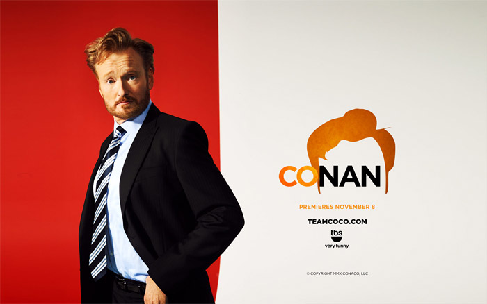
Conan O'Brien's new show, "Conan"
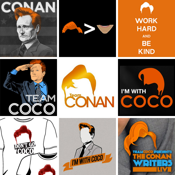
          I've been reading/looking through the idsgn blog recently, and came upon a entry upon the new logo designs for Conan O'Brien's new show on TBS called, "Conan." I noticed how they used salient characteristics of Conan O'Brien (his trademark red coif-like hair) to create a unique and easily memorable icon and designs. With that, the color scheme always utilizes orange because even the color has become a trademark.  What initially may have seemed to be a joke has manifested into a big campaign by fans celebrating his iconic red hair:

        What incited this campaign was the rivalry between Jay Leno and Conan Obrien after Leno had taken over The Tonight Show. It's interesting to see the simplicity and the creativity of the designs that convey an effective message about their support for "Coco."
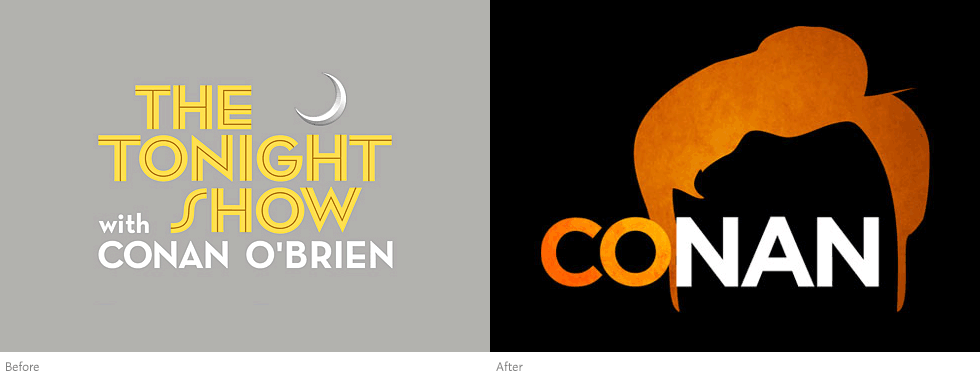
The old and new design for his show.
        The new design of the logo is a great difference from the first logo. It is more ambiguous with the use of just one word "Conan" and one big image of Conan's iconic hair. I guess the objective of the new design was to be more direct and "in your face."  The simple black background alludes to the "tonight" show. The use of a small gradient makes the design more aesthetically pleasing and dynamic compared to the first logo, which is necessary because of the simplicity. It gives a different, more flashy mood. The first logo is more professional and aesthetically pleasing in terms of typography with the use of three different fonts. It emphasizes "The Tonight Show" more than the [former] host "Conan O'Brien," unlike the new logo that makes "Conan" the main focus.


Credits/Links:
[Coco's new 'do @idsgn.org] http://idsgn.org/posts/cocos-new-do/

GALAXY S

I've never cared too much about cellphones in the way that many teenagers and college students are so into what's new with cellphone technology in the iPhone, Blackberry, etc. Recently, my parents upgraded my old very reliable Nokia phone into a new smartphone called Galaxy S.  The past couple of days I've been able to play with it and explore its many different features. I can see the appeal of the Galaxy S through its thin and sleek design, as well as its high tech software and extra features. In my opinion, it’s much like an iPhone, except externally, it’s thinner, smaller, and has a slightly different arrangement of icons on the main screen. 
Samsung's Galaxy S
The Samsung Galaxy S is chockfull of specs that make it distinguishable among the smartphones and unique in its own way. It has a 4-inch multi-sensory touch screen with a Super AMOLED display that’s bright, clear, and anti-reflective so that it's visible even in the sunlight. The use of the Super AMOLED (Super Active-Matrix Organic Light-Emitting Diod) display is one of first of its kind in the cellphone market, which displays the innovation of the Samsung cellphone designers; the Super AMOLED display is ideal as it is a 20% brighter screen, 80% less sunlight reflection, and 20% reduced power consumption. This is an attractive part of the hardware because of the sustainability objective that all designers should strive to achieve. The Galaxy S also has an impressive 5-mega-pixel camera that does selective focus, has built-in photo effects, and is capable of recording video as well.
          The software and additional features of the Galaxy S make it a truly innovative phone. One feature that I really liked was the Swype capability, where when texting or typing anything on the on-screen keyboard, you can just swipe your fingers over the letters for each word (instead of typing each letter one-by-one) and the phone automatically inputs the word. It saves time for texting, which is already fast, but it allows you to work faster. Of course, you can access internet through this phone as that has become a staple in all smartphones. Another cool feature is the "AllShare" where you can play files from the phone to another player like a TV, play file from a server to the phone, or play file from a server to another player via the phone through a Wi-fi connection.
Galaxy S frontside
Galaxy S  backside
          The exterior of the Galaxy S is rather sexy because of the smooth, reflective surfaces of each sides of the phone. It is simple too, and produced only in one color--black, which makes it good for customizing. It is about the size of my palm and probably fits the normal hand perfectly (personally, it's a little too big for my short fingers but no biggie). Ergonomically, the rectangular shape of the phone does not feel ideal or comfortable when being held; I feel like this aspect of the design could have been changed or further explored upon to make it better fitted to the hand and less comparable to the iPhone phones. The thinness and weight of it, however, is a good thing because it does not make it feel like its bulky unlike other smartphones.
          Overall, the Galaxy S is a great and innovatively designed smartphone. It has set the bar higher for smartphones everywhere.

Credit/Links:

Monday, November 8, 2010

Dave McKean

Stills from his movie, MirrorMask
          Professor Housefield has talked about how important it is to find your very own creative voice, which can take a long time to develop but it'll set you apart from all the other designers out there. Brian Fies was able to find his through Mom's Cancer and he was a late blooming cartoonist. One artist that I know will, or is already, influence my creative voice
          Dave McKean has been an artist that I've learned to admire ever since I started reading Neil Gaiman's works, who, by the way, is one of my favorite authors. He is an established and successful illustrator of books and comic books (he illustrated The Sandman covers), filmmaker and graphic designer (he directed MirrorMask), and musician. Talk about being an all around artist!
          It is amazing to find people so passionate about something to the point that it's so apparent. His distinguishable style is derived from surrealism. He combines contrasting


CREDIT/LINKS:
[Info about Dave McKean] http://www.allenspiegelfinearts.com/mckean.html
[Stills from MirrorMask]

[IMBD: MirrorMask] http://www.imdb.com/title/tt0366780/

Words & Images: PETA's Vegan College Cookbook


          In Brian Fies' lecture last week, he showed us how he had to go through hundreds of different designs to find the right cover for Mom's Cancer when it was being published into a book. It shows how in comics and in design, first impressions are important because it's what a customer sees first and it is the determining factor, out of all the books in a bookstore, that makes a customer want to pick it up or not.
          My last birthday, I received a cookbook from a friend that I had always wanted to get. It was PETA's Vegan College Cookbook. The cover is definitely an attention grabber with its simple layout and color scheme. The olive green, blues, and pink colors really work well and compliment eachother and give a friendly feeling because they are not overbearing. The simple layout of the cover reflect the "easy" concept of the cookbook, in terms of comprehension and the recipes themselves.

Credit/Links:
[PETA book cover design] http://www.addebook.com/biomed/html/foods-nutrition/cookbookrecipespetas-vegan-college-cookbook-275-easy-cheap-and-delicious-recipes-to-keep-you-vegan-at-school_23318.html

Words & Images: Mom's Cancer by Brian Fies

Mom's Cancer by Brian Fies
          Last Tuesday, Brian Fies, the cartoonist who created Mom's Cancer and Whatever Happened to the World of Tomorrow? came to DES 001 and gave us a lecture. He told us about the whole process of how he created Mom's Cancer and the story behind it. It was immensely inspiring to hear his story and how, unintentionally, he was able to create the great adversity that his family had to endure, into something that so many people are able to relate to thus making his comic so successful.
A panel from Mom's Cancer website
          Brian Fies' Mom's Cancer show how words and images interact and work together, through allusion, to convey a concept. The interaction between words and images is a powerful one as it gives meaning to the comic. If words or images were on their own, they wouldn't be as powerful in conveying a message, especially such themes of family, death, cancer, etc. that are touched upon in Mom's Cancer. Fies comments that his comic played between the lines of ridiculous and serious, which in a way reflects how words and images play a role in illustrating Fies' style; he used some dialogue from his own experiences, which are mostly serious, and he used image to portray his own imagination, which was sometimes literal or comedic, to add a little humor to a very serious and personal part of his life. He even added color to some panels to depict a different emotion or mood, in contrast to the overall seriousness of the comic. Words and images are a powerful medium not only for comic readers, but also an expressive medium for the illustrator and writer.

A Panel from Mom's Cancer website.

          When Fies spoke more technically about the creation of each panel of the comic, I found it interesting to see how words were the most important aspect; so words are put in first, and then the art/image is worked around them. It makes sense because it is the words that guide the reader and expresses a more specific message. It makes me think of advertisement design and how art is not enough when imparting a concept because communicating a message is what's important. You have to use the combination of words and images to do this. Though concept is the most important part of a design, it can never be imparted correctly without the medium of words and image.

Credit/Links:
[Brian Fies' blog] http://brianfies.blogspot.com/
[all images/panels] http://www.momscancer.com/
[Buy Mom's Cancer on Amazon] http://www.amazon.com/Moms-Cancer-Brian-Fies/dp/0810958406

Tuesday, November 2, 2010

Mugged

          Like the objects in the first couple of minutes of the film in Objectified that are handled by many people during their morning routines, mugs fit the same category of mass-produced objects of industrial design. Mugs are an essential part of the daily lives of many people; it holds their drinks and food even (I put eat my cereal in them!) at the very least, and others find other creative ways of using them.
The typical mug.
            The archetypal form of a mug can be described as a white porcelain cup with a handle. Even as a mug, it still derives itself from a cup. It has a circular bottom thus taking a cylindrical shape. Its lines are not sharp, but not exactly curved. Its edges are tapered just enough so that it's still comfortable for holding in your hands and for putting your lips on. In contrast to its cylindrical shape and also a salient characteristic that differentiates it from any regular cup, it has a handle juts out to an oval shape. There is still continuity in the circles between the handle and the base.  Its simple and prime function is to hold hot beverages. Surprisingly, it is not a object that is looked over. More than likely, you will see decorated mugs more than plain ones, but they all have the same general shape.
Moustache mugs by Peter Ibruegger
          Decorated mugs are a big part of our culture. It's one way society self expresses itself most evidently. It has so much blank space on its surface that we are compelled to personalize it to our liking with many different graphics. Some more ambitious and creative people like to alter it a bit more by creating new handles:
Frustration mug
Brass Knuckle mug on Fredflare

Or  altering its main body:
Totem pole mug on Fredflare
         There are many clever and creative ways to personalize mugs to one's fancy. Mugs are an example of a good design because its simplicity allows so much freedom for creativity. In the words of Paola Antonelli (IKEA) who was featured in Objectified, "democratization of design should not exist."

Credit/Link:
Photos
 -[Typical mug] http://askville.amazon.com/Askville-Mug/AnswerViewer.do?requestId=8585480
 -[Mustache mug] http://www.peteribruegger.com/index.php?/new-product/moustache-moods/
 -[Brass knuckle mug] http://www.fredflare.com/customer/product.php?productid=5241&cat=254
 -[Frustration mug] http://www.community-credit.com/cs/blogs/community_credit_news/archive/2006/12.aspx
 -[Totem pole mug] http://www.fredflare.com/customer/product.php?productid=5579&cat=254

Monday, November 1, 2010

OBJECTIFIED: form & content

          Last Thursday, we watched a film about design during the second half of DES001. In the documentary film, Objectified, one of the designers in the movie (who's name I couldn't jot down fast enough) described three phases that a design usually goes through in order to realize some kind of meaningful function. The three phases are form, symbolism and content, and contextual sense. In this blog, I want to focus on how form and content interact in design.
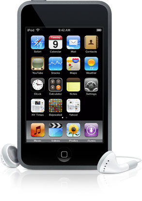
         One of the designers that I was able to jot down was Jane Fulton Suri, a chief creative officer from IDEO, a global design firm; she saw designers as being capable of being "culture generators," and that "they design scenarios based on objects to see the consequences of their choices." In the process of designing things, form is the constraints of the content of a design in the physical world. Designers indirectly influence popular culture by taking certain concepts/content and making them real in many different forms. A very good example of a company that advocates good design explored by the film is Apple, because they think so innovatively. Jonathan Ive, a senior VP at Apple, asks such questions as"why is it like that and not like this???"  when they looks at products, including their own. He emphasizes how you, as the client or the targeted audience, have to connect with the product. The main content of their products are interaction design and with that, they like to continue that concept with its form. For example, the iPod touch and Macbook Pro have a smooth, stylish, sophisticated, yet simple design to reflect the user friendly interface and sophisticated software inside. The simplicity of their physical form makes it more universal because it looks more approachable and appealing. It can be easily personalized, and it has no particular target audience.
MacBook Pro
Ipod Touch
          The quality of their forms, from the Macbooks aluminum body and the iPod Touch's stainless steel back and glass screen, reflects the quality of the software. This is why Apple is revered for having good design in a lot of their products, when form and content meet on the same level.


Credits/Links:
[Objectified film by Gary Hustwit] http://www.objectifiedfilm.com/
[Info about Jane Fulton Suri] http://www.ideo.com/people/jane-fulton-suri
[Info about IDEO] http://www.ideo.com/about/
[Macbook pro] http://www.komplettblog.ie/tag/macbook-pro/
[Ipod Touch] http://www.techerator.com/2009/11/comparison-motorola-droid-vs-ipod-touch/